I was recently updating my UX & Usability Consulting page and found myself writing an essay about why card sorting is often not the best solution. I quickly realised that it was not a conversation many people cared about, so I am moving it into a blog post for the main audience – UX nerds like me, and people who are considering card sorting.
What is Card Sorting?
Card Sorting is a UX research method where study participants group individual labels (representing ‘chunks’ of content) in a way that makes sense to them. The goal of it is to uncover the users’ mental models, in order to better understand how to organise your content.
Much smarter people than me (the ones I learned from) have written thorough articles and guides on how to run a card sorting exercise, so I won’t repeat it here.
The Challenge
In reality, most organisations are not equipped to run or interpret the results of a proper card sorting exercise. To do so and gain useful insights, you will need a minimum of 15 participants and either a lot of time, and/or some very expensive software.
Examples where this might not be a barrier include:
- Charities or non-profit organisations where acquiring a large number of volunteer participants who are representative of your target user is easy AND you have the resources to run the test internally (or some funding to pay someone to do it for you, in which case hi);
- Companies or organisations who are targeting ‘everybody’ (it is easy to find example participants affordably through available recruitment methods);
- Companies or organisations with a bloody big budget, who can afford to spend the time to make sure they have a deep understanding of their user’s mental models.
My Two Cents
UX research methodology tells us that we can’t gain actionable insights with less than 15 participants, but does this mean we don’t get value from doing even a small number of card sorts? Personally (and in my professional opinion experience, I think even 3 card sorts can still provide valuable information IF combined with other, more accessible research methods.
Getting the most bang for your lack of buck
The poor-person’s card sorting tool that I’ve been using for years is Miro. It’s a pretty simple to use platform, and while it sucks for quantitative analysis, it’s great for quick and dirty studies that help you to achieve the same goal – uncover the mental models of your users.
Here is how I use the concept of card sorting during discovery to help guide information architecture:
- Do a content inventory and audit. Do it first. Brainstorm all the chunks of content you want to have, then be ruthless and kill your babies until you have a working list. If you have a wild amount of things – e.g. 50+ sticky notes (each representing a content chunk) I would suggest that you split your content loosely into two or more groups. Generally not all content is aimed at all users – you’ll probably find that chunks are predominantly for distinct audiences. For example on the Murdoch University website, there are two broad target audiences. If I were going to do a card sorting exercise for this site, I would divide my content into two groups – stuff for people who are already part of the ecosystem (students, staff) and stuff for people who are not (prospective students, potential collaborators). If something is ‘in between’ – e.g. information for Alumni – I would include this in both card sorts.
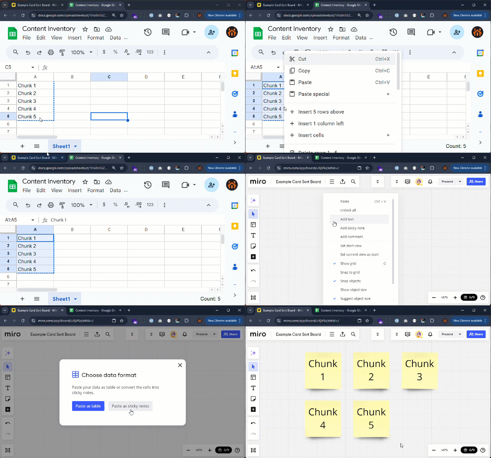
- Dump it all on a page. It is obnoxiously easy to do with Miro – just copy and paste.

- Duplicate the content for each person who is going to do the exercise. It is tempting to work through it all together, but the problem with this is that your users will influence each other. This isn’t to say they can’t do it at the same time – just set a timer, give them the exercise, and then let ’em loose. While this can also be done in person, it’s way more time consuming because you have to literally write up sticky notes (nobody has yet invented the IRL copy/paste function)
- Discuss as a group. This is the bit that I think gives the most insight, because it lets people challenge and explain their mental models. It might be tempting to let them change their answers, but I’d recommend against it – instead create a new ‘working’ sort and do it together as a group based on everyone’s individual responses. Ideally, have someone facilitating who knows what they are doing and can make educated decisions based on the results and IA best practices.
- Tree Test.
Tree Testing – did we get it right-ish?
Ultimately there is no such thing as the ‘perfect’ information architecture or navigation. What you really need to test for is whether or not your version of it makes sense to your users and aligns close enough to their existing mental models that it will do the job. Tree Testing and Usability Testing are both great ways of doing this, and can be conducted with significantly less users (as little as four) than a card sorting study. You can also use usability testing to pick up on things that don’t quite work if you already have a functioning prototype!

