
I have a confession.
This was one of the fonts used on the first website I ever built for a client:
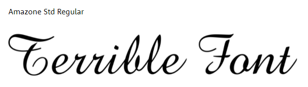
Fortunately I don’t have to take full responsibility for this, as I inherited the design – and we managed to confine it to being used on a single page for one piece of text. Despite that, it still keeps me up at night, and I like to think that I’ve come a long way since then both in my understanding of what constitutes good and bad typography, as well as my ability to communicate that information with clients.
I thought that it would make sense to put everything I’ve learned in one place, so that I can direct people to it if they want to read in more detail about any of the tools, tips and tricks that I’ve picked up along the way. I hope that this helps you, help the internet, be a better place for everyone!
Table of Contents
1. Respect the Font Designer
Let’s start with the least controversial advice:
Never stretch fonts.
This seems obvious, but I still see people do it on Canva all the time. Maybe if you are a designer you can get away with stretching a font on a logo – but even then it is considered bad practice. If you need a font to take up more or less space, there are a few options you can use to get around it without resorting to butchering the font some poor designer poured their heart and soul into. For example:
- Increase the letter spacing (space between letters)
- Use a font that includes different versions (e.g. Condensed or Wide)
- Increase the font weight (this will usually make it a little wider)
- Use a different font
Just please, avoid doing this:

2. Less is More.
It’s easy to get carried away when you have so many choices at your fingertips. There are 1364 font families on Google Fonts alone at the time of writing this post, and more are added regularly. If you go a little deeper it gets even more bonkers, with sites like DaFont listing almost 65,000 font styles.
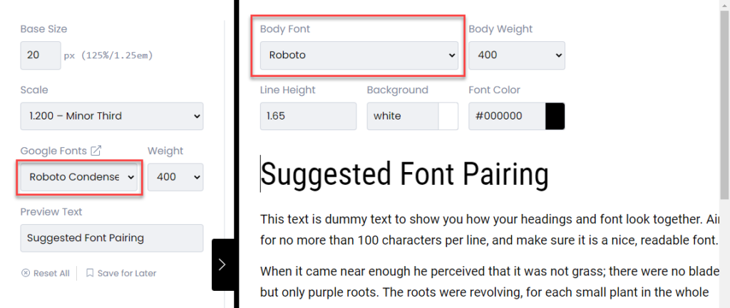
If you are not a trained designer you’re probably safest sticking with a maximum of two of those. Specifically, I would recommend choosing a heading font and a body font, and I would recommend choosing them from the Google Font library. More about why I recommend that soon!
There are loads of tutorials and guides out there that provide advice on how to choose fonts that pair nicely together. My favourite tool for testing Google Font pairings (as well as a bunch of other stuff) is Type Scale.
3. Think about your readers
Have you ever got one of those annoying recaptchas where to prove you aren’t a robot you have to decipher hieroglyphs that are allegedly type?
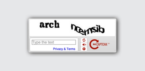
This might be how a dyslexic person (approximately 10% of the population) feels when they read the text on your website, if you use the wrong font. Designing for everyone is a field known as acessibility and there are some tips and tools you can use to make sure your designs are as accessible as possible.
Font Size
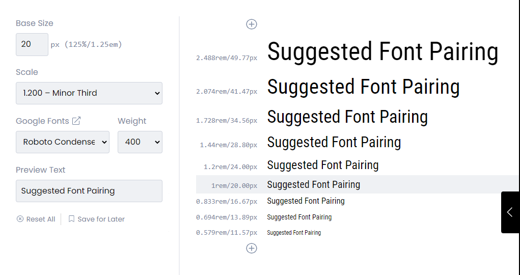
This one is super easy and obvious – don’t make your text to small. My standard is either 18px or 20px, depending on the font in question. For reference, the Web Content Accessibility Guidelines classify the following as large text:
~18.66px (14pt) or larger and bold; OR
24px or larger for normal text.
Again, I really love using Type Scale for working out my font sizes. I put in my base size as either 18px or 20px, choose a scale and BAM! There are your heading font sizes, all nicely balanced. My personal favourite scale is the Minor Third:
Spacing
Having bigger fonts isn’t the only prerequisite for easy reading. Even with a nice, clean, friendly font at 20px, if your spacing is off your readers will struggle. Try to avoid adjusting letter spacing on paragraph text, because it looks weird.
See? This is annoying. Why are the letters so squashed?
This is also annoying. Just stop.
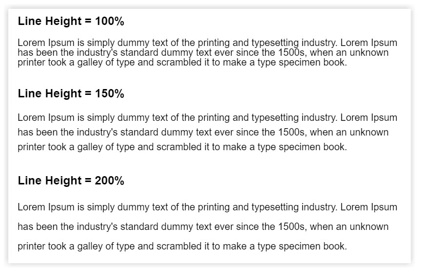
I also recommend setting your line height (that’s the name for the space between lines inside a paragraph) to something sensible. While there is not universally accepted golden number for line height, I find that 1.65 works pretty well for most fonts. Line height typically uses ratio units, so 1.65 is equal to 165% of the ‘base’ font size.
Characters per line
For people who have reading or vision disabilities, long lines of text can become a significant barrier to consuming content. Even for those who don’t, a narrower block of text is substantially easier to read. There is some really interesting science behind this (if you are a nerd like me) and you can enter the rabbit hole here if you’d like to read about it in more depth.
For now, all you need to know is that you should aim for an absolute maximum of 100 characters per line (CPL) but ideally lines should not exceed 80 CPL. Less is even better. This may mean being a little bit clever with your layouts! Sidebars on blogs aren’t just there for decoration, they also make use of the space on the page while ensuring that text is easily readable.
There are two ways to reduce the number of characters per line: Either you can reduce the paragraph width (by adding white space or an image, for example) or you can increase your font size. If you want to check your CPL quickly just copy the top line of a paragraph into a letter counter like this one. If your character count is less than 80 you are winning!
Text Alignment
For those of us who read from left to right, we rely on a jagged edge on the right hand side to help us navigate between lines. It’s not a conscious act – but numerous studies have shown that reading speed is significantly increased with left aligned text compared to justified text (where both left and right sides of a paragraph make a straight line). Justified text might be fine for a newspaper, but it definitely should not be used on the internet!
STOP SHOUTING!
OK, this one is actually a bit tricky… technically there are some good reasons to use all-caps. Recent studies have actually shown that stand-alone text (just a few words in isolation) can actually be more quickly legible in all-caps. There might, therefore, be an argument for using all capital letters on a call to action button.
Having said that, the majority of legibility studies indicate that the use of all-caps should be avoided for longer passages of text, including headings, subheadings and paragraphs.
Choose the right font
With so many fonts available to choose from, it can be hard narrowing it down to the one that best suits your voice. Something that you should take into consideration, however, is whether the font you choose is making reading more difficult for your audience. Fonts that are overly artistic or vary a lot from the ‘standard’ characters we expect can be difficult to read, especially for those who struggle already (like the 1 in 10 people with dyslexia). While there are no hard rules around font accessibility, here are some things you can test for easily that impact font legibility.
Imposters
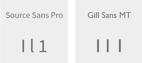
Watch out for fonts where multiple characters are identical. The most common example of this is uppercase i, lowercase L, and the number 1. This can make it difficult for users to differentiate between the characters in question.
Discernibility
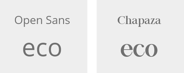
If you don’t know what I mean by discernibility, giggle your way through this list of 20 signs that prove why font choice is so important. Discernibility determines whether or not a reader is likely to accidentally confuse certain letters, due to the similarity in shape. A common example of this is the lower case characters o, e and c – all of which are the same height and rounded.
Mirroring
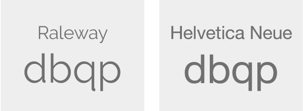
This is pretty easy to identify, but unfortunately most modern sans serif fonts are guilty of it. Mirroring refers to flipping letters back-to-front which can cause a ‘hiccup’ in the brain’s shape translation process – especially for those with reading difficulties. You can test for mirroring using the letters d & b, or q & p.
Final Thoughts
There are lots of other things that are important for good design that are more technical in nature, like hierarchy, contrast, kerning… but those things are very subjective and honestly, if you’re at a point where you can afford to think about these things you either are a designer or need to hire one. In the meantime, I hope that this list of bits and bobs is useful for someone!