
What do women want?
POCKETS.
If you’ve never had the misfortune of purchasing a garment with pockets that aren’t real, you are truly blessed. For most women this is a regular occurrence, and one of the true mysteries of the universe. Here’s a jacket I bought recently…
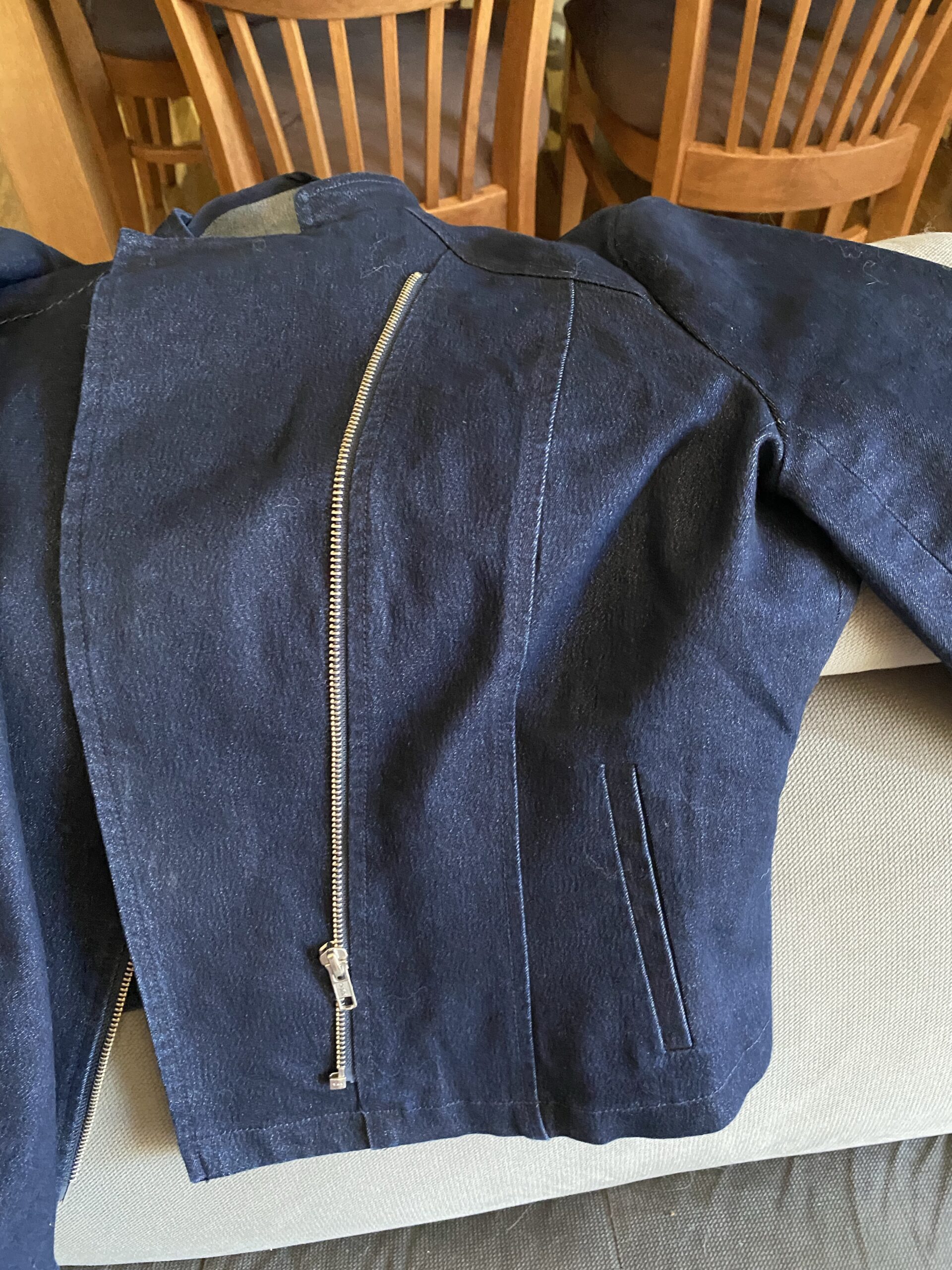
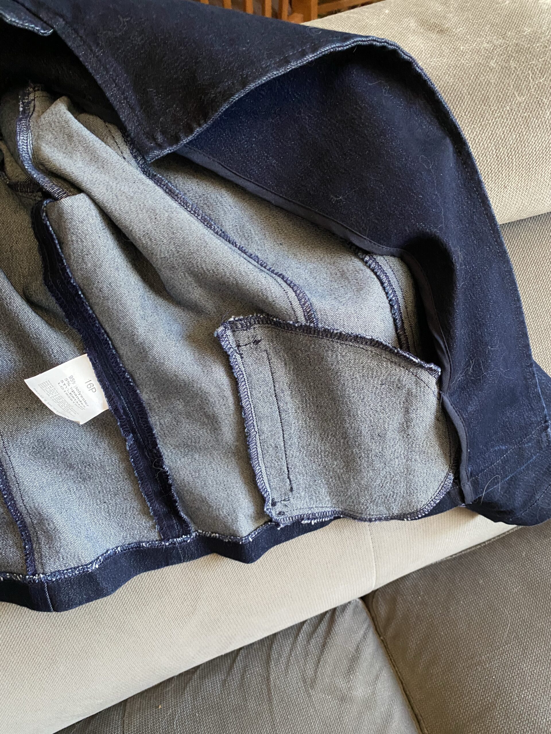
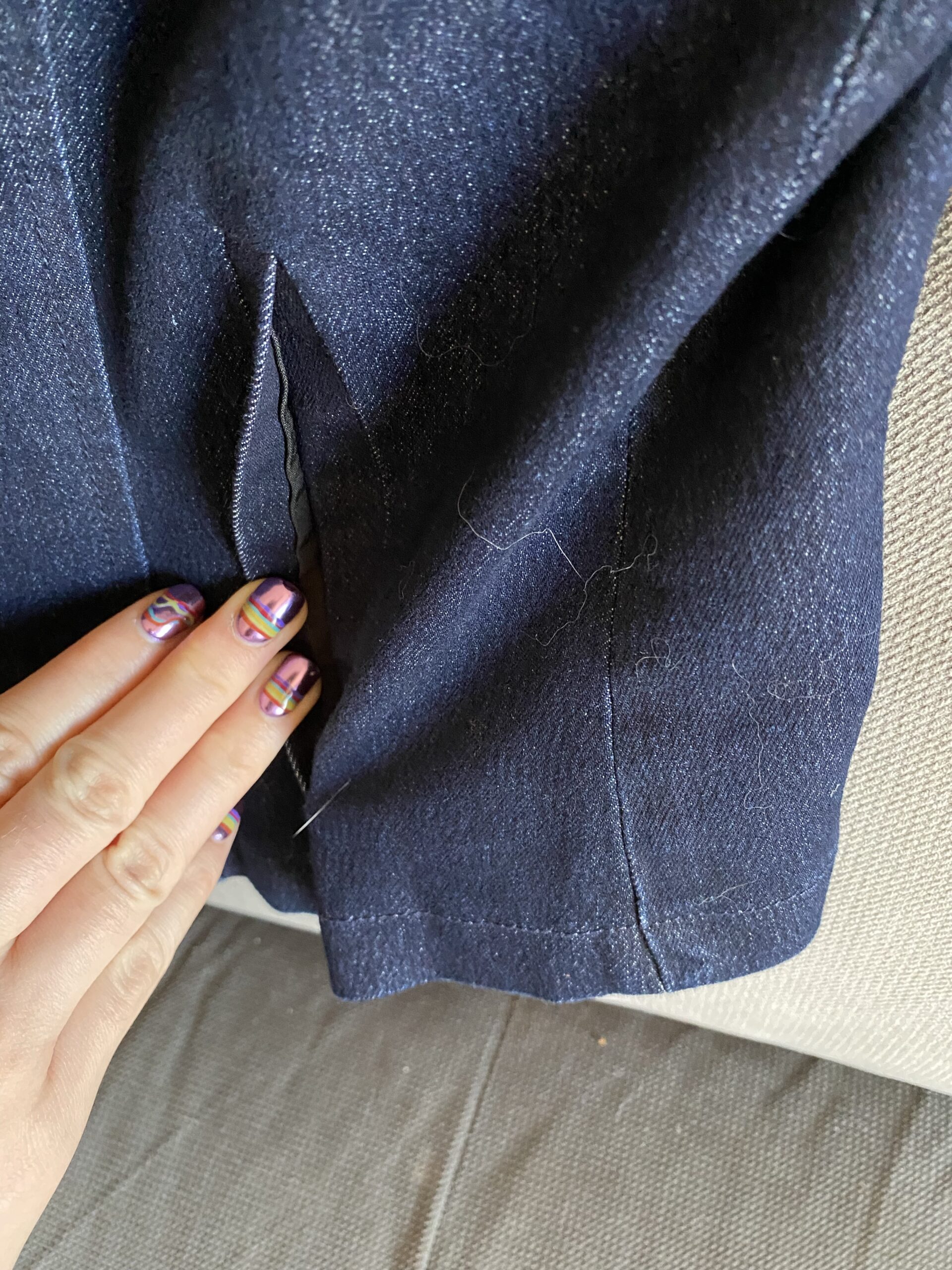
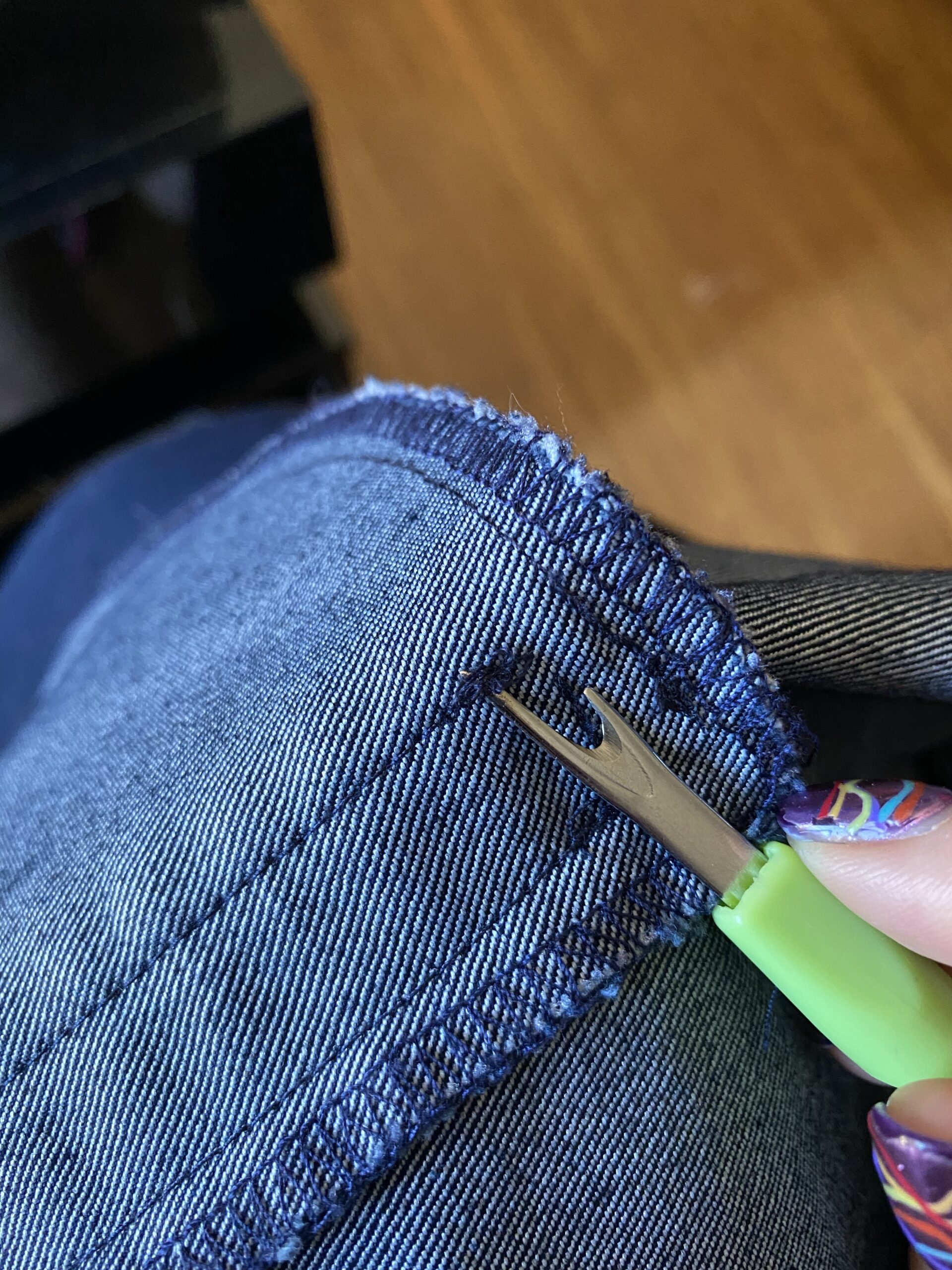
“That’s not fake,” I hear you exclaim! It’s just stitched shut for *reasons* you silly girl. Hold on to your seats disbeliever…
This is by no means limited to jackets – women’s pants are particularly renowned for their commitment to stopping us from carrying snacks wherever we want. Here are some pants that slipped through my personal FPDS (fake pocket detection system)…
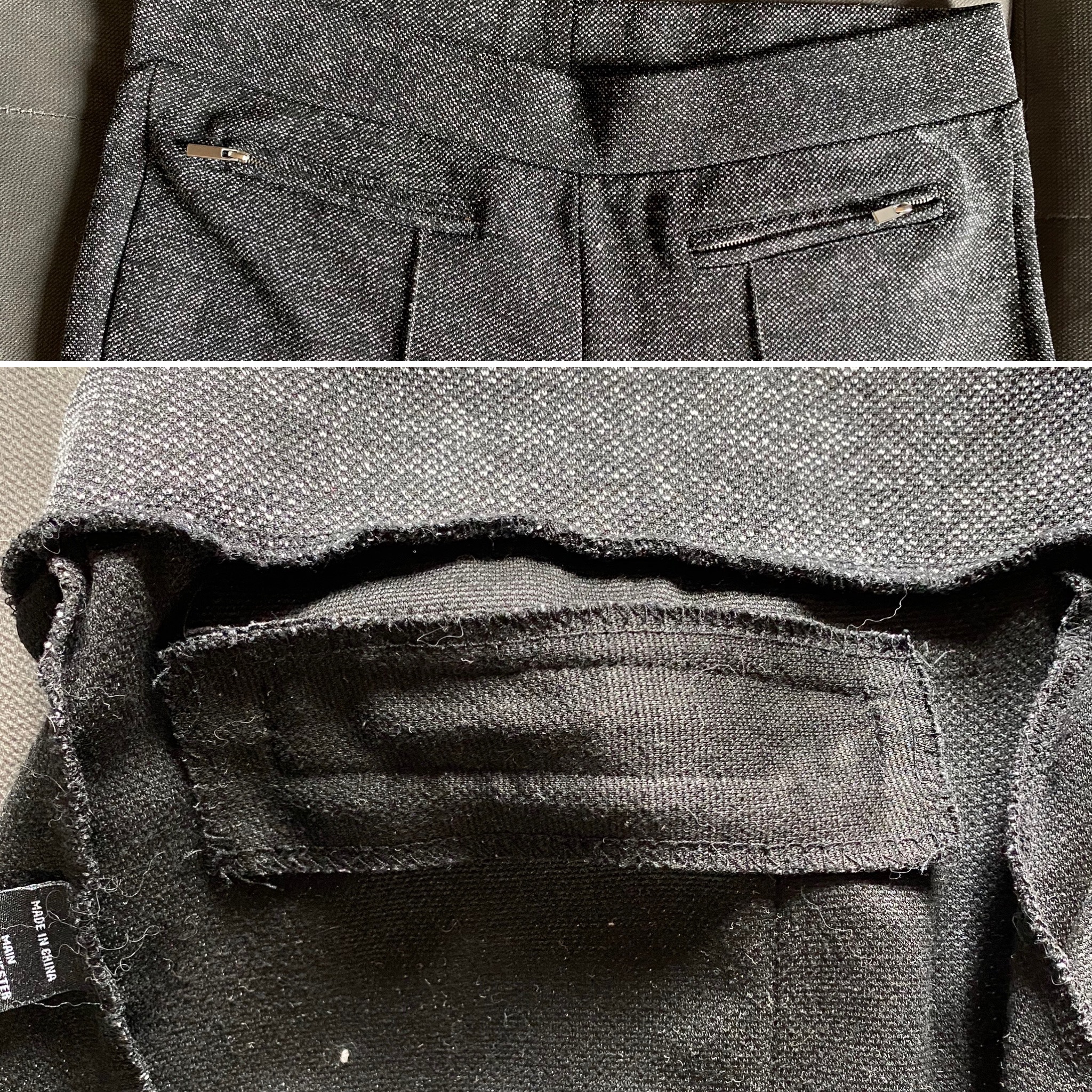
The frustrating thing is that as an amateur sewing enthusiast myself, I can tell you that sewing a REAL pocket is much easier than sewing a fake one. The amount of fabric it uses is negligible, and the argument that the choice is cost related doesn’t hold up under scrutiny given that women pay (on average) 7% more than their male counterparts for equivalent products.
In my opinion, fake pockets are the ultimate example of poor user experience for the sake of aesthetics – they might look nice but not only are they not functional, they frustrate and confuse the user making them less likely to engage again. Those pants? They’re at the back of my wardrobe collecting dust and I no longer shop at the place I purchased them from.
For most of us, fake pockets are a mere inconvenience, but they can teach us a great lesson about interaction design.
Let’s detour from pockets for a moment and take a look at some websites. I’m sure you’ve probably experienced something like this before, where you click on an item in the navigation menu and either nothing happens, or what does happen is unexpected. Perhaps the “Products” navigation item only brings up a drop down menu, despite the lack of drop down arrow and the fact that the mouse hover indicates the item is clickable. Maybe the “free online quote” button actually just brings up a generic contact form.
Often these decisions aren’t made purposefully, but more due to a lack of planning and foresight. Maybe the designer and developer didn’t communicate the needs of the client efficiently, or the business owner wanted a free quote button but didn’t know how to implement it properly themselves. Unfortunately, that doesn’t make it any less annoying for the user, and ultimately may end up costing the website owner a conversion or return customer.
So how do we avoid this?
User Testing
The first and most important thing for existing website owners in my opinion is to use a tool such as Hotjar to get some real data about your user interactions. It’s free, and super easy to set up. I love the recordings feature, and especially the ability to filter by “rage clicks” to identify the biggest problem areas. Without data, any decisions or changes you make are based on guesses!
There are lots of other tools out there if you have time or budget to dive deep, but if you are at that point in your UX journey I’d recommend hiring an expert to facilitate more complex user testing.
User Journeys
Put yourself in the shoes of some of your users – and there will be more than one! Think about things like:
- Familiarity (Is this their first time visiting your site?)
- Mindset (Are they ready to take action yet?)
- Demographics (Will they understand that word or symbol?)
- Urgency (Are they time poor or under pressure to complete a task?)
Often the answer to these questions will vary depending on what stage of their journey they are in. There may not be any real urgency if it is their first time visiting a site and they aren’t yet ready to take action.
Mobile Experience
For a majority of the internet, mobile users are now more prevalent than desktop or laptop users. We also know that cross device visitors are common – for example someone may browse on mobile and purchase on desktop.
It doesn’t make sense then not to optimise your mobile (and specifically, touch screen) interface for your users. On desktop it is simple to click on a top level navigation item such as “products” to view all, instead of choosing a category from the drop down. However on mobile this same menu layout will require users to “double tap” which is not intuitive or obvious. In situations like this you could, for example, add an “All Products” item to the drop down menu.
Expectation vs. Reality
Don’t trick people. It leaves a bad taste in their mouth and multiple studies have shown that surprises are bad for conversions. My favourite article about this by Nielsen Norman Group titled “A Link is a Promise” is a great place to start if you are interested in the evidence. Even further than that though, show your users what to expect so that they have clear expectations that meet reality. A great way to achieve this is through good microcopy such as button or navigation labels.
Rant Wrap-Up
Deliver on promises, whether they are pockets or buttons. Your users will thank you.